All Links Dialog Box
- Click the Processing tab to open the Processing Workspace.
- On the Processing Workspace Toolbar, click Linking:

Provides a central location for:
- viewing currently configured control links
- accessing each control link's properties dialog box
- manually activating/deactivating control links, and viewing which control links are active
- adding new controls to an existing control link (or deleting existing controls)
- deleting existing control links
- configuring new control links
- adjusting the priority order of existing control links
- editing a control link's name

| UI Element | Purpose |
|---|---|
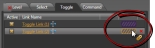
| Tabs (Level, Selector, Toggle, Command) | Every link is of a certain Control Link Type . Each tab in this dialog box displays a list of all existing links of that type. In other words, all the Level links are displayed on the Level tab, Selector links on the Selector tab, and so on. See About Control Links for more details on the control types. . Each tab in this dialog box displays a list of all existing links of that type. In other words, all the Level links are displayed on the Level tab, Selector links on the Selector tab, and so on. See About Control Links for more details on the control types. |
| Elements on each Tab |
Add a new link by clicking the + icon in the lower right corner. Delete an existing link by hovering the mouse over the link in the list and then clicking the red X in the far right column. Activate an existing link by selecting its Active checkbox. Deactivate an active link by deselecting its Active checkbox. Add a new control to an existing link by dragging the control's link icon and dropping it on the purple box to the right of the link (the box turns yellow when you drag a link icon—of the correct type—over it): note: You can only add controls of the same type as the link (in other words, you can add only a Level control to a Level link, a Selector control to a Select link, and so on). If adding a static Selector control (for example, a Logic In which can have only a two-position Selector), all linked Selectors must have the same number of selections (in the case of Logic In, two selections). The control links are listed in priority order on each tab, with the highest priority link at the top of the list. Adjust the priority by clicking the Priority arrows in the lower left corner. For more details on control link priorities and how they work, see About Control Links. |
 See Also