Palette
- Click the Processing tab to open the Processing Workspace.
- On the Processing Workspace Toolbar, click the Control Systems drop down menu then select Control Page Designer. In the window that opens, the Palette appears on the left side of the window:

The Control Page Designer palette displays three tabs: Pages, Controls, and Elements. Each of these contain or let you create a set of control page elements available for use on your control pages. You can add a control, image, or another element to a control page by dragging it from the palette and dropping it onto the workspace.
You can also create additional control pages and add elements to a control page that allow your end user to navigate between pages.
- To select a tab containing the elements that you wish to use, simply click on the tab name:
- Pages - for the set of control pages.
- Controls - for the set of controls that you want to use on each control page. You link these controls to other controls in the Processing Map.
- Elements - for images, workspace labels, separators, a navigation panel, and login/logout buttons.
- Add an element to the current control page by clicking and dragging it onto the Page Layout Workspace, dropping it anywhere you like. You can then configure it as desired:

tip: The Default Control Size drop-down menu just below the palette area allows you to choose one of four sizes that Halogen uses each time you drag an element from the palette and drop it on the workspace. This lets you create all page elements with the same size, eliminating the need for manual resize after dropping the elements. Note: You can still adjust the control size after you have dropped an element onto the control page.

| UI Element | Purpose |
|---|---|
|
User Pages |
The list of pages includes all control pages in the configuration, including those that you've created and those that HAL needs to operate properly. To add a new blank page, click on the add page icon to the right of the User Pages label:
note: You can also create a new page by clicking on the You can delete an existing page from the palette. Use your mouse to hover over an existing page and a delete page (x) icon appears. Click this icon and Halogen deletes the control page from the configuration:
warning! When you delete a control page, it is removed from the configuration. Be sure that you really want to delete the page before you click on the x icon. Page Links If you drag a page icon from the palette to the page layout workspace, Halogen creates a page link at the location in the layout workspace where you dropped the page. A page link is a button which allows the control page user to switch to the target page by clicking the button. To add a page link to the current control page, drag the desired target page icon from the palette to the page layout workspace as described above. note: Halogen does not allow you to add page links for some pages in the palette. Namely, you can't add a link to the current control page or to the Error and Login pages. When a page icon is dim in the palette, you cannot drag it to the current control page to create a page link element.
DR6 Over-resource Error Icon The Control Page Designer displays an error icon next to a page on the palette if that page is assigned to a DR6 which has exceeded its resource capacity: The most likely cause for this is exceeding the image capacity of the DR6 - either by including too many images or by using large image files. To correct this problem reduce the number and/or size of the images used on control pages assigned to the DR6. If the DR6 still indicates that the resource capacity is exceeded try reducing the number of pages assigned to the DR6, using the Configure Page Access Dialog Box. With some experimentation you can find which control pages are causing the problem. |
|
Web System Pages |
These are pages that the HAL system uses for web controls only (i.e., they are not used on the DR6). You can format them as desired, but cannot navigate to them directly. |
 |
These buttons move the selected control page up or down in the list of User Pages. This is useful for the Navigation Panel page element and the DR6 page navigation interface, where page order is given by the order of the User Pages list in the Pages palette. |

|
Adds a new (empty) control page to the User Pages list. |

|
Duplicates the selected control page retaining all existing controls, making an exact copy of the currently selected page. |

|
Duplicates the selected control page, but creates new controls of the same type for each of the existing controls on the selected page. Use this option to create a new page that is similar to another, but is intended to link to a different set of controls than the original page. An example would be creating a set of pages to control separate zones, where each page should look the same but use unique controls for each zone. |


| UI Element | Purpose |
|---|---|
|
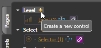
Level Select Toggle Command |
This is a list of external controls that you can use on your control page. Any controls that you've added to the set of External Controls appear in this part of the palette, organized by control type. You can add a new control by clicking on the add control icon next to the type name that you wish to add. For example, to add a new Level control, click the add control icon next to Level:
note: You can also create a new control by clicking on the You can delete a control from the palette. Use your mouse to hover over an existing control and a delete control icon appears. Click this icon and Halogen deletes the image from the configuration:
warning! Deleting a control also deletes it from every control page that it is used in and also from the set of configured external controls. To add a control to the current control page, drag the control from the palette to the page layout workspace as described above. note: You can only include a control once on a particular control page. When a control is present on a control page, the corresponding control in the palette becomes dim, indicating that you're already using that control on the page. |
|
|
Creates a new Level control. |
|
|
Creates a new Selector control. |
|
|
Creates a new Toggle control. |
|
|
Creates a new Command control. |

|
Opens the External Controls dialog, allowing you to view and edit all external controls defined for the configuration. See External Control Systems. note: The controls that you see in the Control Pages dialog are also External Controls. |
| Filter Control List drop-down menu. |
Allows filtering of the controls that appear in the palette, which aids in configuring control pages when many controls are present. The options are: All Controls: Shows all controls regardless of use on the current control page. (default) Unused on Page: Show only those controls that you have not yet added to the current control page. In Use on Page: Shows only those controls that are included on the current control page. This is useful for verifying that all controls on a page have been linked. |
 (Level),
  (Selector),
  (Toggle), or
  (command) icon at the bottom of the palette.

| UI Element | Purpose |
|---|---|
|
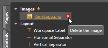
Images |
This is a list of images that you can add to your control pages. To add a new image to the palette, click on the add image icon to the right of the Images label:
note: You can also create a new image by clicking on the After you add an image to Halogen Control Pages, it is added to the Halogen configuration file and no longer is associated with the file that you selected when adding the image to the palette. Halogen has limits on image files that it allows.
note: Sometimes, Halogen will change the original filename to meet naming rules needed for the HAL web server. When it does this it changes unsupported characters in the name to underscores, _. For example, 'My Picture.jpg' would be renamed to 'My_Picture.jpg'. The allowed characters are letters, numbers, and underscore. You can delete an image from the palette. Use your mouse to hover over an existing image and a delete image icon appears. Click this icon and Halogen deletes the image from the configuration:
warning! Deleting an image also deletes it from every control page that it is used in. To add an image to the current control page, drag the image from the palette to the page layout workspace as described above. If you want to rename the image file to something more meaningful or pick another image, click on the image hyperlink, which opens the Property dialog for the image:
note: If you change the image to a new file, Halogen replaces all of the image elements that you've added to any control page with the new image. |
|
Layout |
The Layout section includes a set of page elements that you can use to improve the appearance or information on your control pages. A Workspace Label allows you to add text to a page, formatted as desired with or without a border or background. The Vertical Separator and Horizontal Separator elements allow you to provide visual separation between other page elements in the layout. The Page Navigation Panel provides an automatic set of page navigation buttons for the current user and the pages assigned to the device (web or DR6). The HAL web server and DR6 devices automatically create the list of buttons based on the Page Access settings and the currently logged in user, showing buttons for the set of pages that both the device and the current user can access. For more information about user and device access to control pages, see User Interface Reference. To add a Layout element to the current control page, drag the desired element from the palette to the page layout workspace as described above. |
| User Access |
Includes page elements related to user access for your control pages, providing the ability for the user to change the current user logged into the device. The Login button provides a way to change the current user to another user. The Logout button changes the user to Unsecured, which automatically performs a logout of the current user. To add a User Access element to the current control page, drag the desired element from the palette to the page layout workspace as described above. |

|
See Images, above |


 See Also