External Control Systems
- Click on the Processing tab to open the Processing Workspace.
- On the Processing Workspace Toolbar, click the Control Systems drop down menu then select External Controls.
Provides a central location for:
- Viewing currently configured controls for use with external control systems
- Viewing and setting the unique number defined for each external control
- Viewing and updating the current value of each external control
- Setting the Label text for each external control
- Enabling and disabling each external control
- Accessing each external control’s properties dialog box
- Configuring new external controls
- Deleting existing external controls
- Establishing a control link between an external control and other controls
| UI Element | Purpose |
|---|---|
| Tabs (Level, Select, Toggle, Command) |
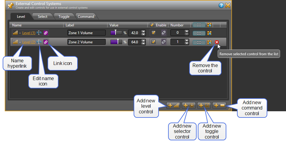
Every external control is of a certain control type. Each tab in this dialog box displays a list of all existing external controls of that type. In other words, all the Level controls are displayed on the Level tab, Selector controls on the Selector tab, and so on. See About External Control Systems for more details on the control types. Add a new external control by clicking one the four Add Control buttons in the lower right corner. Each button adds a control of the corresponding type and switches to the tab for that control type. |
| Name |
Rename an individual external control by clicking on its edit icon and typing the new name in the edit box that appears. Open the properties for an individual external control by clicking its name hyperlink. Link the control to another control of the same type by clicking, dragging, and then dropping the link icon onto the link icon of the other control on the Processing Map or Control palette. When the two controls are linked, they track one another (as long as the link is active). |
| Label |
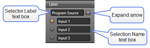
Displays the external control's label text. All control types have at least one label that you can view and modify by editing the text box. A selector control also displays the names for each selection, and allows you to change them by editing the text boxes. If the selection names are not visible, click the expand arrow.
|
| Value |
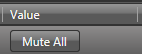
This column allows you to view and change the value of the control. The available controls are different for each type of external control: Command
For a command control, the dialog displays a button representing the command. Click the button to send the corresponding command message via the external control server.
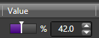
Level
The level slider and edit box reflects the current value (from 0 to 100%) of the level control, which you can manually adjust from within the software. Changing the value causes the external control server to send a corresponding set level message.
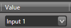
Selector
When linked to a processing workspace selector control, the drop-down menu shows the current selection. Change the selection by clicking on the drop-down control and choosing a different item. Each time you change the selection, the external control server sends a corresponding set selection message.
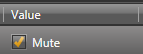
Toggle
The checkbox reflects the current value (checked or unchecked) of the toggle control, which you can manually adjust from within the software. Each time you change the state of the toggle, the external control server sends a corresponding set toggle message.
|
| Enable |
Enable designates whether or not the external control is enabled. You can manually enable or disable the control from within the software, or provide end users with the ability to enable or disable the control—by saving the desired state to a preset that is exposed to end users, or by linking the Enable Toggle control to another Toggle control. |
| Number |
Change the unique Number assigned to an individual control by clicking on the arrows next to the number text box or entering a new number in the text box. The software forces this number to be unique among all external controls regardless of type. |
| Preset icon and Update Baseline Preset button |
Add an external control to a Preset by opening the All Presets dialog and dragging the blue preset icon,
Update the baseline preset to the current values of the external control by clicking on the Update Baseline Preset button, |
| Delete control |
Delete an existing external control by hovering your mouse over the control in the list and then clicking the X icon that appears on the far right of the row. |
 , and dropping it on a preset’s blue <Add> box.
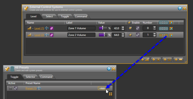
 .
.  See Also