Label
The label block is a simple text field that can be positioned on the processing workspace and serves as a location to enter notes about the configuration or to simply mark the boundaries for different groups of blocks. The label can be resized as needed and includes properties for horizontal and vertical alignment, text bold, italic, underline, and font size, as well as setting of the background, border, and font colors.
Use the Label block to serve as a place to capture notes about the configuration or to simply mark the boundaries for different groups of blocks.
- Click the Processing tab to access the Processing Workspace.
- Below the processing palette area (to the left of the workspace) is an icon and text for adding labels to the processing workspace. You have two options for adding the label to the workspace.
- Click and drag the label into your Processing Workspace. (Holding the label at the edges of the workspace auto-scrolls to other areas). Once the hashed drop target is in position release the mouse button to add the label to the workspace.
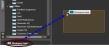
- Double-click on the workspace label icon or text to add the label to the right of the currently selected block(s) in the workspace. If nothing is selected the label is positioned in the middle of the visible portion of the workspace.
- Click and drag the label into your Processing Workspace. (Holding the label at the edges of the workspace auto-scrolls to other areas). Once the hashed drop target is in position release the mouse button to add the label to the workspace.
- Once the label is on the workspace its size can be adjusted by hovering and dragging from any edge or corner of the label block.
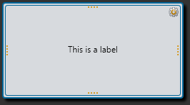
- Open the Label block's properties by double-clicking the block or hovering and clicking the properties icon that appears in the block's upper right corner. The properties dialog box contains properties to set the text and its appearance. From this dialog box, you can do the following:
- Set the text to be shown in the label.
- Set the horizontal alignment of the text to: left, center, or right aligned.
- Set the vertical alignment of the text to: top, center, or bottom aligned.
- Set the text to be bold, italic, or underlined.
- Set the display size of the text.
- Set the background, border, and text colors.
| UI Element | Purpose |
|---|---|
| Text | The text in the label can serve as a place to capture notes about the configuration or to simply mark the boundaries for different groups of blocks. |
(Hover over the thumbnail below to view the properties dialog box.)

| UI Element | Purpose |
|---|---|
|
Text |
The text in the label can serve as a place to capture notes about the configuration or to simply mark the boundaries for different groups of blocks. note: When entering names and other text, such as labels and notes, you can use nearly any Latin character and many symbols. For more details, see Allowed Display Characters. |
|
Horizontal Alignment |
Allow alignment of the display text to the left, center, or right of the label box. |
| Vertical Alignment | Allow alignment of the display text to the top, center, or bottom of the label box. |
| Bold, Italic, Underline | Allow all of the text in the label to be normal or any combination of bold, italic, and underlined. |
| Display Size | Specify the display size of the text in the label. |
| Colors | Specify the color for the text itself, as well as the label background and border colors. |
 See Also