Toggle Control Page Element Dialog Box
This is a sub-dialog box of the Control Pages Designer dialog. To access the Control Page Designer, see Control Page Designer Dialog Box
Open the common Page/Page Element properties dialog for the Toggle control that you wish to view in one of the following two ways:
- Double-click on the toggle control or the toggle control's label in the page layout workspace.
- Select the toggle control or the toggle control's label by clicking on it, then click on the Properties menu button in the Control Page Designer toolbar:
Provides the ability to view and modify properties for the currently selected toggle control page element in the page layout workspace.
The Toggle control properties and the toggle control appearance on the control page are different depending upon the Toggle Type that you've selected for the control: Button, Switch, or Status.

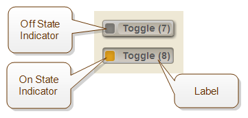
Button type toggle controls appear as follows:
note: The following image shows one toggle control, Toggle (7), in the off state (unchecked) and another, Toggle (8), in the on state (checked).

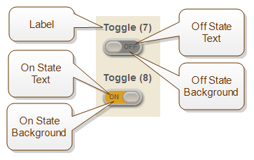
Switch type toggle controls appear as follows:
note: The following image shows one toggle control, Toggle (7), in the off state (unchecked) and another, Toggle (8), in the on state (checked).

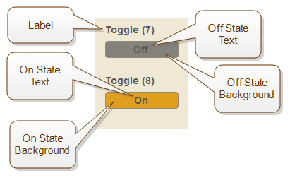
Switch type toggle controls appear as follows:
note: The following image shows one toggle control, Toggle (7), in the off state (unchecked) and another, Toggle (8), in the on state (checked).
The details for all of the Toggle control properties are as follows:
All of the color properties below use a common set of controls similar to the following:
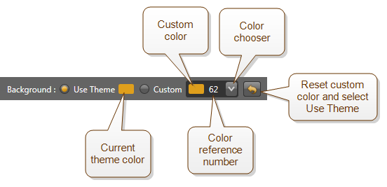
When the Use Theme is configured, which is the default, Halogen uses the current page theme color.
When Custom is configured, Halogen uses the color shown in the color chooser. To select a new custom color, click on the color chooser drop-down arrow and scroll the list to find the color that you desire to use, then click on it.
The number beside the color in the color chooser is a unique reference number for that color to help you set the custom color to a specific color, perhaps matching a custom color that you've selected for a page element.
The color reset button  resets the custom color to the current theme color and changes the selection to Use Theme.
All of the layout properties below use a common set of controls similar to the following:
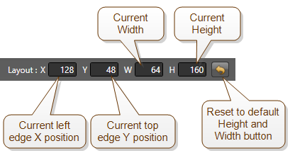
As you change the page element's position or size, the layout properties change to reflect the current settings.
You can also change position or size by entering new values directly into the Layout property text boxes.
note: Some page elements do not support resizing in both dimensions. In this case, the layout properties area shows all of the settings (X, Y, W, and H), but disables those you cannot change. For example, the HAL system sets a Selector control's height according to the number of selections in the active link. Because of this, the control page designer disables the H text box for the control.
The reset button resets Height and Width to the defaults for the page element's selected Size.
| UI Element | Purpose |
|---|---|
| Name |
This is the name of the external control, which is the same as the name in the Control Page Designer palette. To change the name, enter a new value in the text box. |
| Layout | The top left (X,Y) position and height and width of the toggle control. |
|
Size |
A drop down menu which selects the overall size of the toggle control as it appears on the control page. |
|
Toggle: Type |
Selects the type of toggle to use on the control page: Button, Switch, or Status. |
|
On State: Indicator color (Button type only) |
This is the color setting for the toggle control's Indicator when the toggle is in the on state (checked). |
|
On State: Text (Switch and Status types only) |
This text appears inside the toggle control when the toggle is in the on state (checked) To change the text, enter a new value in the text box. |
|
On State: Text color (Switch and Status types only) |
This is the color setting for the toggle control's Text when the toggle is in the on state (checked). |
|
On State: Background color (Switch and Status type only) |
This is the color setting for the toggle control's Background when the toggle is in the on state (checked). |
|
Off State: Indicator color (Button type only) |
This is the color setting for the toggle control's Indicator when the toggle is in the off state (unchecked). |
|
Off State: Text (Switch and Status types only) |
This text appears inside the toggle control when the toggle is in the off state (unchecked) To change the text, enter a new value in the text box. |
|
Off State: Text color (Switch and Status types only) |
This is the color setting for the toggle control's Text when the toggle is in the off state (unchecked). |
|
Off State: Background colo (Switch and Status type only) |
This is the color setting for the toggle control's off state Background when the toggle is in the off state (unchecked). |
| Label: Layout
(Switch and Status type only) |
The top left (X,Y) position and height and width of the toggle control's Label. |
| Label: Show | Check this box to show the toggle control's label on the control page. Uncheck it to hide the label. |
| Label: Text | This is the text of the toggle control's label on the control page. It is the same as the label of the external control. |
| Label: Text color |
This is the color setting for the toggle control Label text. |
| Label: Style
(Switch and Status type only) |
Select style attributes for all of the text in the control's Label to be normal or any combination of bold, italic, and underlined. |
| Label: Alignment
(Switch and Status type only) |
The first set of three buttons allows horizontal alignment of the control's Label text to the left, center, or right of the label box. The second set of three buttons allows vertical alignment of the label's text to the top, center, or bottom of the label box. |
| Layering |
All elements on a control page can overlap each other and are layered according to the order that you added them to the page. If you'd like to adjust the order so that this element appears either behind or in front of the other elements it overlaps, use these controls. To move the element to the top of the order, so that it is in front of all other elements on the page, click the To move the element to the bottom of the order, so that it is behind all other elements on the page, click the |
| Enable |
This checkbox enables or disables the control on the control page. When a control is enabled, it is fully operational on the page and the user can change the control's value. When disabled, the control appears grayed out (dim) and the user can see the control's value but cannot change it. This enable control is the same as the Enable for the external control and you can link it to another toggle control in the Halogen configuration to control the enable state when the system is operating. |


 icon.
icon. icon.
icon. See Also