Page Layout Helper Controls
- Click the Processing tab to open the Processing Workspace.
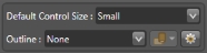
- On the Processing Workspace Toolbar, click the Control Systems drop down menu then select Control Page Designer. In the window that opens, the Page Layout Helper Controls appear in the bottom left corner of the window:

Provides controls that help with control page layout:
Default Control Size allows you to choose the size to use when you drag an element from the palette to control page workspace.
The Outline drop-down menu provides a visible outline on the workspace for a range of common device screen sizes.
| UI Element | Purpose |
|---|---|
|
Default Control Size |
The Control Page Designer uses this selection when creating new controls and other page elements as you drag them from the palette and drop them on the workspace. The drop-down menu includes the four sizes of controls and other page elements:
Choose the size that you want to use before adding the page elements to a page. |
|
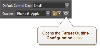
Outline |
This feature lets you display a visible outline on the workspace for various target devices to help you with control page layout. To display the outline for a target device, click on the drop-down arrow and make a selection. Included are the DR6 and several common mobile devices:
After you select a target device, the workspace displays an outline that shows the screen size for the selected device. For example, the with Apple iPhone 6 selected, the workspace looks like this:
When you select DR6 : Rane in the Outline drop-down menu, the Control Page Designer also displays a shaded area for DR6 specific screen regions, such as the auto-navigation tab region or button. For example, when the DR6 is configured to use auto-navigation tabs, the workspace looks like this:
Outline OrientationFor devices other than the DR6 (which is always landscape), the
If you select Landscape for the iPhone 6, for example, the workspace looks like this:
Configuring Device Target OutlinesThe Control Page Designer provides outlines for many common mobile devices. The Outline drop-down menu includes only a subset of the devices that Halogen includes. You can change the devices that appear in the drop-down menu and define your own custom target outline using the Target Outline Configuration dialog. To open this dialog, click on the gear icon within the Page Layout Helper area:
For details on configuring target outlines, see Target Outline Configuration Dialog Box. |


 button (Outline Orientation) allows you to select the orientation of the outline displayed on the workspace, either Portrait or Landscape:

 See Also