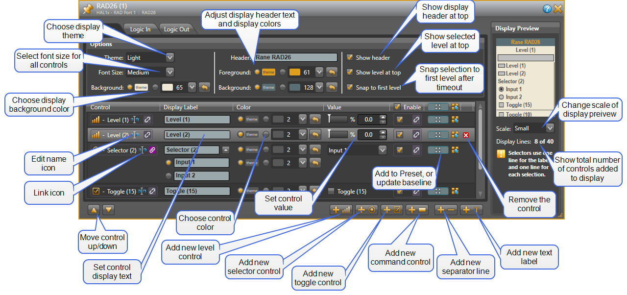
RAD26 Device Control Properties
- Click the Processing tab to open the Processing Workspace.
- On the far left Processing Palette, click the Control tab.
- In the Remote Audio Device Ports category, click a yellow RAD26 device name text, which is a hyperlink, to open its properties.
Provides a central location for:
- Adding LCD display and logic I/O controls to the RAD26 device
- Modifying the configuration and the order of controls on the RAD26 device
- Deleting controls from the RAD26 device
- Establishing control links between the RAD26 controls and other controls
- Viewing and changing each control's name
- Setting the Display Label text and color for each display control
- Viewing and updating the current value of each control
- Enabling and disabling each display control to render it invisible on the display
- Adding each control to a preset and updating the baseline preset to current control settings (Display & Logic Out only)
- Viewing a simulation of how the Display controls look on the physical RAD26 device. Or choose a theme for background and foreground colors, and font sizes.
| UI Element | Purpose |
|---|---|
| Title Bar Name | Area at the top of the properties dialog box that displays the RAD's Device Name as well as the HAL/EXP device model, the HAL/EXP port to which the RAD is connected, and the RAD model: 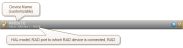 |
| Options panel |
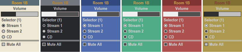
The display options specify how controls are displayed on the RAD26 screen. Theme
There are six color themes for the RAD26 display: Light, Dark, Blue, Green, Red and Gold. Each theme has a coordinated set of colors for the screen background, header background and foreground, and text foreground colors. These colors can be individually overridden, or if left to follow the theme all change accordingly when a new theme is chosen.
Font Size
There are three choices for Font Size: Small, Medium and Large. The selected font size is applied to all text in the display.
Display Background
The display background color can follow the selected theme or you can also choose from 184 custom background colors. When the theme radio button is selected, the background color is defined by the theme. Click the dropdown button to select one of 184 available colors from the dropdown list. To restore the background color to the Theme default, click the reset button shown to the right of the dropdown list. Header
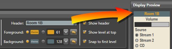
It is often desirable to add a Header to the display for the purpose identifying what is being controlled: room name, function name etc.
The default Foreground (text) and Background colors for the Header are determined by the selected theme. As with the control area, it is possible to select 1 of 184 custom colors for Header foreground and/or background. Just click the custom radio button, click the drop down menu and select a new color. To return to the default, press the reset button to the right of the dropdown button. In some cases, you may prefer to have more space for controls and not include a header. In this instance. Uncheck the Show header Check box to disable display of the header. note: A yellow border and warning icon appears if not all of the header text will be visible on the RAD26 display. Show level at top
In some instances, it is desirable to always show the currently selected level at the top of the display. This makes it easier for end users to quickly identify exactly which level is adjusted using the top RAD26 knob, especially when the RAD26 controls many different levels. If this option is enabled and only one level has been added to the list of controls, the level is always shown at the top of the display (or just below the header if the header is visible) and is not included in the list of controls shown below. If this option is enabled and multiple levels in the controls list, then the currently selected level is shown at the top. When no level is selected, the last selected level is shown. Snap to First Level
You can optionally allow the RAD26’s top volume knob to automatically revert or snap back to control the same, say, "Main volume” control, after end users walk away from the device. The intent is to provide consistent behavior for the top volume knob when end users come back later to adjust the RAD26 volume. When using a single Level on the RAD26 screen, the top volume knob always controls the one and only one level, ensuring consistent volume knob behavior - regardless of what item in the display is highlighted. But when multiple Levels are available for adjustment, checking the Snap to First Level checkbox automatically moves the selected or highlighted Level to the first or top Level on the RAD26 display. Once the end user stops adjusting the RAD26, the Backlight timer starts counting down. When the timer expires, the highlighted item automatically moves to the top-most RAD26 Level. Thus, the top volume knob acts consistently and controls the same, most-often-used Level when end users return to adjust device. note: Set the Backlight Timeout in the Hardware Workspace’s RAD26 Properties dialog. When Snap to First Level is unchecked and the highlighted item is not a Level, the top volume adjusts nothing. No level, not even the last highlighted one changes. This means the top knob does nothing until the end user highlights any Level on the display. When Snap to First Level is unchecked and a Selector is the highlighted item, after the Backlight Timeout, the highlight simply moves to the selected item, if needed. This ensures that, after the timeout, the highlighted selector is also the selected selector. |
| Preview panel |
Preview
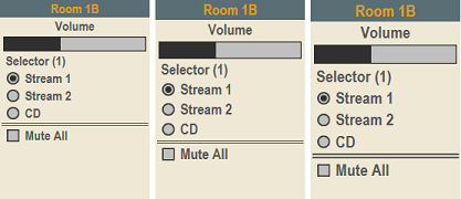
Shows a virtual representation of the LCD as it appears on the RAD26 device. This gives you an idea of what the RAD26 actually displays for the controls configured for this device. Scale
The size of the preview display shown in Halogen can be set to small, medium and large, depending if your priority is to preserve screen real estate or show more screen detail. Display Lines
The RAD26 display shows a maximum of 40 display lines. Levels, Toggles, Command, Separators, and Labels each count as 1 line. The source selector uses one line for the Label and one line for each source selection. As controls are added to the list the total display lines count is kept up to date so you can see how many of the 40 display lines have been used. If the total count goes over 40 the remote resources are exceeded and the display shows a "Resources Exceeded" message in lieu of the control list. note: The Display Preview allows you to see how the RAD26 looks even when offline and without hardware. Super genius. |
| Controls panel |
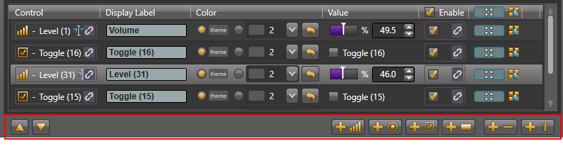
This panel is used to add, organize and label individual controls in the RAD26 display.
Six control types may be added to the display: Level, Selector, Toggle, Command, Separator, and Label. Each control type has a control identifier, Display Label, Color, Value, Enable, add to preset icon and an Update control in the baseline preset. New controls are added to the end of the list, but the panel also shows buttons that allow you to move the selected control up or down in the list. Selector Controls
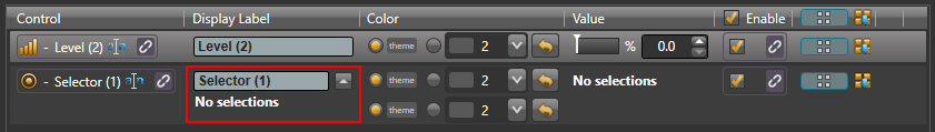
When a selector is first added it appears as shown below:
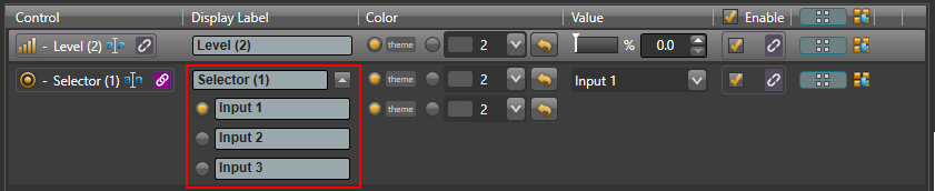
There are no selections available as the display control has not yet been linked to a selector control. When linked to a selector, the control adopts the number of selections of the control it is linked to. The figure below shows the result of linking a display selector control to a three position selector.
In the selector Display Label fields you can create the selector control name as well as the individual selection names that appear in the display. You are able to select a custom color for the Selector label and a second color for the individual selection names as shown above. For convenience, to expand or collapse the list, press the arrow to the right of the Selector control label. The selector value can be changed by clicking on the radio buttons next to the display labels or via the dropdown list of available selections in the Value column. To highlight a control’s row, click anywhere inside the control's row in the list. |
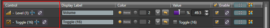
| Control |
Shows the control type icon and name of the control as well as the standard control link icon.
You can change the control name by clicking on the edit name icon. You can link the control to another control of the same type on the Processing Map (for example, a Mute control). To do so, click, drag, and drop the control link icon onto the link icon of the control on the Processing Map. |
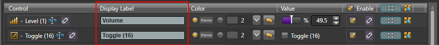
| Display Label |
Shows the label that appears on the RAD26 device. You can type a custom label in the edit box.
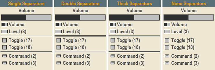
note: A green border and warning icon appears when not all of the text will be visible on the RAD26 LCD. When highlighted on the RAD26 display, the first 30 characters in the label scroll left then right repeatedly across the screen; into and out of view. note: A yellow border and warning icon appears when not all of the text will be visible on the RAD26 LCD. When highlighted on the RAD26 display, the first 30 characters in the label scroll into view, but any characters greater than 30 are not scrolled into the visible area of the RAD26. warning! Halogen stores display names for RAD26 controls in the baseline preset and in any other presets that you've added the control to. This means that after you have changed a RAD26 display name, you should update the control in the appropriate presets. If you don't, the next time a preset that includes the control (including the baseline) is activated, the display label that you just entered reverts back to the default that was stored in baseline (or preset) when the control was initially created. To update a RAD26 control in the baseline preset after changing the display label, click the Update Baseline Preset button on the far right: In the case of Separator controls, instead of a display label the separator style can be set to one of the following options: Single, Double, Thick and None.
|
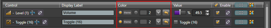
| Color |
The Color field allows you to use the theme color for the display label text or select a custom color.
When the theme radio button is selected, the text color is defined by the theme. Click the dropdown button to select one of 184 available colors. To restore the background color to the Theme default, click the reset button shown to the right of the dropdown list. |
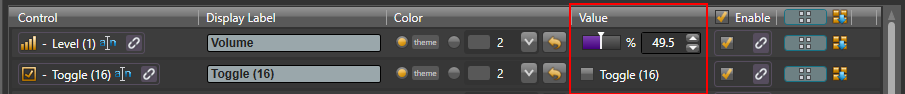
| Value |
Displays and allows you to change the current state of the control according to its Control Type.
Level: Set a new ratio metric value by clicking on the slider and moving it to a new position. Alternatively, enter a new value into the text box or click the up or down arrow to the right of the text box. Selector: Choose a new value by clicking on the drop-down arrow and selecting an item. Toggle: Check or uncheck the toggle checkbox Command: Assert the command by clicking on the button. The Display Preview allows you to see how the RAD26 will look even when offline and without hardware. Super genius. |
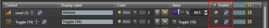
| Enable |
Designates whether or not this RAD26 control is enabled and, therefore, visible or not on the RAD26 display. You can manually enable or disable the control from within the software, or provide end users with the ability to enable or disable the control—by saving the desired state to a preset that is exposed to end users, or by linking the Enable Toggle control to another Toggle control. When a control is disabled, it does not appear on the RAD26 display. The control is still functional in Halogen, but the user cannot use the control on the physical device. You can use this setting to selectively change which controls the user is able to view and use on each RAD26 depending on your application. |
|
Preset icon and Update Baseline Preset button |
The preset icon, When you click on the Update Baseline Preset button, |
| Remove control icon | This red icon appears when you hover with your mouse over a control item in the list and it is possible to remove the item. Click on the icon to remove the control from the list. |
 .
.
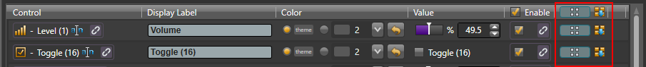
 , allows you to add one or all RAD26 controls to a preset. When you drag the preset icon in the upper header area and drop it on a valid preset drop target, Halogen adds all of the RAD26 controls to the preset. If you drag the preset icon from an individual control (or row), Halogen only adds that control to the target preset.
| UI Element | Purpose |
|---|---|
| Title Bar Name | Area at the top of the properties dialog box that displays the RAD's Device Name as well as the HAL/EXP device model, the HAL/EXP port to which the RAD is connected, and the RAD model: |
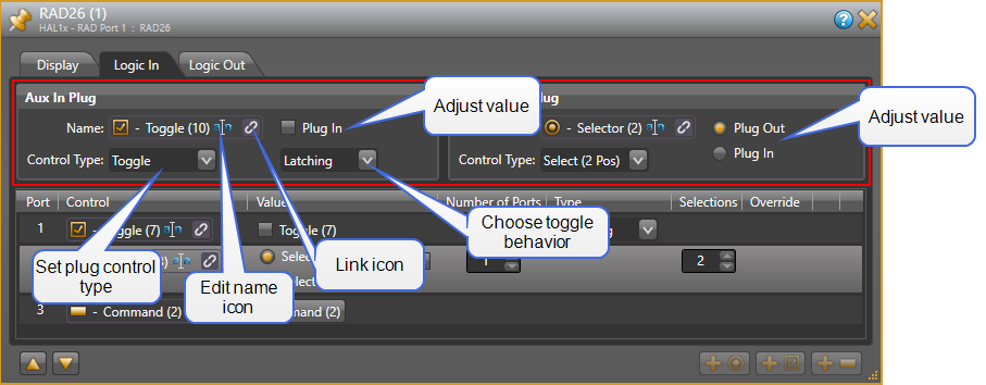
| Name |
Shows the control type icon and name of the control as well as the standard control link icon. You can change the control name by clicking on the edit name icon. You can link the control to another control of the same type on the Processing Map (for example, a Mute control). To do so, click, drag, and drop the control link icon onto the link icon of the control on the Processing Map. |
| Control Type(on Logic In tab: Aux In Plug /Headphone Plug) |
The type for the plug control can be set to either Toggle, 2-Position Selector, or Command. Toggle
Aux In Plug: Use the Toggle setting for Aux In Plug to automatically link any Toggle control(s) in Halogen to follow the state of Aux In Plug state. For example, use Toggle when you need a Toggle Preset to automatically turn off or override the currently playing audio source every time a jack is physically plugged in to the Aux input. Thus, both the Aux In Plug and the Preset are Toggle types, allowing them to be linked together by dragging their Link icons onto each other. Headphone Plug: Use the Toggle setting to automatically link to any Toggle control(s) to, for example, mute the line and/or amp outputs of the RAD26 when headphones are plugged in. The line and amp outputs turn back on once the headphone cable is unplugged. Select (2-Pos)
Aux In Plug: When Aux In Plug is configured as a 2-position selector link it only to a two-position selector with options that correspond to the two jack states: plug in, or plug out. Thus, it is only the two radio button Preset, or Selector Link that can be used to track the physical plug’s state – in or out. Headphone Plug: Similarly, if you want to display a 2-position selector so end users can tell when a headphone jack is plugged in to the RAD26, use the Select (2-Pos) setting. Command
When Aux In Plug or Headphone Plug is configured as a Command, the associated control in the Control palette of the Processing Workspace is a command type. This permits linking to a Command control type, such as a Command Preset. |
| Value |
Provided controls allow you to change the current state of the Logic In Plug control according to its Control Type. Toggle: Check or uncheck the checkbox. Select: Change the selection by choosing between the two radio buttons: Plug Out and Plug In. Command: Assert the command by clicking on the button. note: You can change the state of a Logic In Plug value from within Halogen even when connected to HAL. When connected, the value follows the state of the Logic In Plug, but you can override it by clicking on the value controls (check box, or radio buttons depending on type). This simulates changes from the physical RAD26 switch (allowing you to test the control links). You can also do this when offline, but in this case, since there is no physical switch, Halogen does not consider the control to be overridden. |
|
Override |
The Cancel button appears when you have overridden the current state of the physical switch attached to the Logic In plug. Click the button to revert to the actual state of the Logic In port. note: HAL cancels all read-only overrides when you disconnect Halogen or on HAL reboot. |
| UI Element | Purpose |
|---|---|
| Title Bar Name | Area at the top of the properties dialog box that displays the RAD's Device Name as well as the HAL/EXP device model, the HAL/EXP port to which the RAD is connected, and the RAD model: |
| Logic In panel |
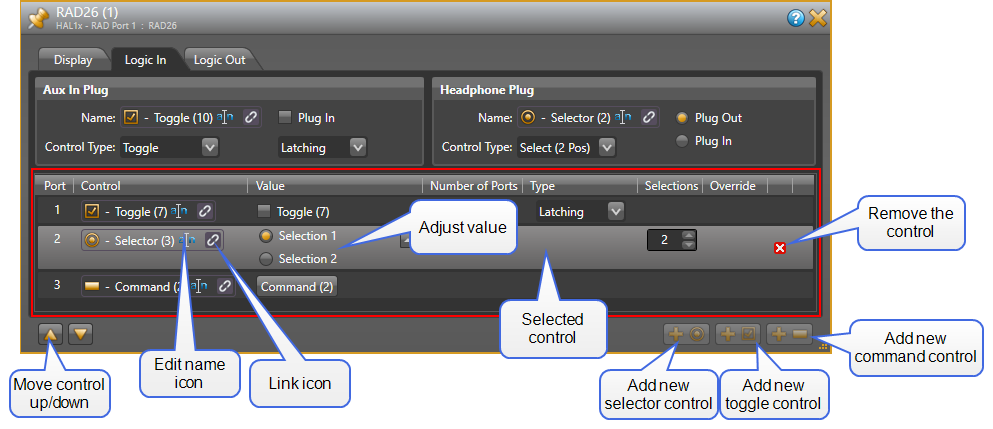
This section of the Logic In panel contains a list of Logic In controls configured for the RAD26. The panel also shows buttons that allow you to move the selected control up or down in the list and to add a new selector, toggle, or command control to the end of the list. Toggle Controls
When a port is configured as a toggle control, the Type setting allows you to configure the type of physical switch that you are using. This setting is available only for toggle controls and allows you to select either Latching (default) or Momentary. See Momentary and Latching Toggle Configuration for more information about configuring these inputs. Command Controls
When a port is configured as a Command, the associated control in the Control palette of the Processing Workspace is a command type. There are no configuration options for this type of control. Selector Controls
When a port is configured as a Selector, the Number of Ports, Type, and Selections columns work together to allow you to configure the number of selections included in the associated selector control in the Processing Workspace. To select a control, click on anywhere inside the control's row area in the list. |
| Port |
The Port number corresponds to the physical Logic In hardware port on the RAD26. Three logic input ports are available and you can configure them in a variety of ways. |
| Control |
Shows the control type icon and name of the Logic In control as well as the standard control link icon. You can change the control name by clicking on the edit name icon. This name is intended to help you identify your controls when working in the Processing Map. You can link the control to another control of the same type on the Processing Map (for example, a Toggle Preset control). To do so, click, drag, and drop the Logic In link icon onto the link icon of the control on the Processing Map. note: To change the Control Type, delete an existing control by clicking the red ‘x’ at the far right, and add a new control using the lower right Add control type buttons. |
| Value |
Displays and allows you to change the current state of the Logic In control according to its Control Type. Toggle: Check or uncheck the checkbox. note: You can change the state of a Logic In Toggle from within Halogen even when connected to HAL. When connected, a Latching type Logic In Toggle follows the state of the Logic In port, but you can override it by clicking on the toggle check box. This simulates changes from the physical switch (allowing you to test the control links). You can also do this when offline, but in this case, since there is no physical switch, Halogen does not consider the control to be overridden. Command: Assert the command by clicking on the button. Select: Change the selection using the drop-down menu. note: You can also view the selector value as a set of radio buttons by clicking the 'expand' arrow on the far right of the Value column. |
| Number of Ports |
Use this to configure the number of physical RAD26 Logic In ports to use for the selector. As you change this value, the Port column shows the ports currently allocated to each control. |
|
Type |
When the Logic In control type is toggle, Type allows you to view and set the toggle configuration: Latching or Momentary. Latching toggles are read-only while Momentary are not. When the control type is selector and the Number of Ports allocated to the control is greater than one, you have a choice for how the RAD26 uses the Logic In signals to determine the selected item One-Of or Binary. One-Of: the RAD26 treats each port as a separate selection input, where the lowest port is selection 1, the next lowest port is selection 2, and so on. Binary: the RAD26 treats the set of ports as a binary number that determines the current selection. The lowest port is the least significant bit of the binary number while the highest port is the most significant bit. In operation, the RAD26 makes the selected item of the associated selector control in the Processing Workspace according to the value of the binary number of the allocated ports. A binary value of 0 corresponds to the first selection, a binary value of 1 corresponds to the second selection, and so on. note: When you've allocated a single RAD26 Logic In port to a selector, the Type is always binary, providing a two item selector control in the Control palette of the Processing Workspace. |
| Selections | This column shows how many selections are provided by the associated selector control in the Processing Workspace. For a One-Of configuration, this is always the same as the number of ports allocated to the control. For a Binary configuration, you can set this to match the number of selections that you desire, up to the maximum allowed by the binary number. |
|
Override |
The Cancel button appears when you have overridden the current state of the physical switch attached to the Logic In port. Click the button to revert to the actual state of the Logic In port. note: HAL cancels all read-only overrides when you disconnect Halogen or on HAL reboot. |
| Remove control icon | This red icon appears when you hover with your mouse over a control item in the list and it is possible to remove the item. Click on the icon to remove the control from the list. |
| UI Element | Purpose |
|---|---|
| Title Bar Name | Area at the top of the properties dialog box that displays the RAD's Device Name as well as the HAL/EXP device model, the HAL/EXP port to which the RAD is connected, and the RAD model:  |
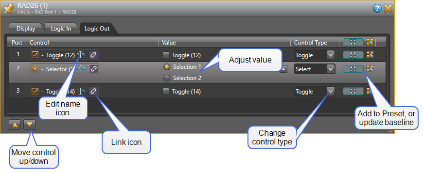
| Logic Out panel |
This panel contains a list of Logic Out controls configured for the RAD26. The panel also shows buttons that allow you to move the selected control up or down in the list. To select a control, click on anywhere inside the control's row area in the list. |
| Port | The Port number corresponds to the physical Logic Out hardware port on the RAD26. Three ports are available and you can configure them in a variety of ways. |
| Control |
Shows the control type icon and name of the Logic Out control as well as the standard control link icon. You can change the control name by clicking on the edit name icon. This name is intended to help you identify your controls when working in the Processing Map. You can link the control to another control of the same type on the Processing Map (for example, a Mute control). To do so, click, drag, and drop the Logic Out control link icon onto the link icon of the control on the Processing Map. |
| Value |
Displays and allows you to change the current state of the Logic Out control according to its Control Type. Toggle: Check or uncheck the checkbox. Select: Change the selection using the drop-down menu. note: You can also view the selector value as a set of radio buttons by clicking the 'expand' arrow on the far right of the Value column. |
| Control Type |
Allows you to view and change the control type of the Logic Out port - Toggle or Two Position Selector.
|
|
Preset icon and Update Baseline Preset button |
The preset icon, When you click on the Update Baseline Preset button, |